Bethany Reynolds
Click on a block to visit a page.
| |
Home |
| |
Workshops
& Lectures |
| |
Books,
Patterns & Rulers |
| |
Quilt Gallery |
| |
Teaching Schedule |
| |
What’s
Stack-n-Whack®? |
| |
Cool Stuff |
| |
Contact Bethany |
.If you are taking the Mystery Quilt 2003 Workshop, please review this page as well as the general information on fabric selection (see the "What's Stack-n-Whack®?" link on the menu bar).
Select your Main Print first. It should have a lengthwise design repeat of at least 6" (8" or longer is better). Look for a print with good contrast.
Choose light, medium, and dark fabrics to go with the main print. It may help to look at the color registration dots on the selvage of the main print. You don't need to match the dots, but checking them may help you to notice colors in the main print that you might have overlooked. These "hidden" colors might serve as inspiration for the accent fabrics.
 |
For this Mystery Quilt, you'll be safest choosing mottled texture prints for the accent fabrics. Subtle prints will work, but avoid "busy" prints which might detract from the main print. Directional fabrics may be hard to control.
Here is a lively combination. The medium fabric position is a good place to use a bright accent color "pulled" from the main print. |
|
|
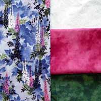
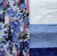
Here is the same main print with a different combination of accent fabrics. The light fabric is the same, but two values of the same hue (in this case, blue) have been used for the medium and dark fabrics. This color scheme would be quieter than the one above. |
|---|---|
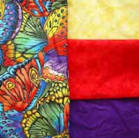 |
Here's a very bright combination featuring a Hoffman butterfly print. The main print has a long repeat (about 24"). Prints on this scale will yield a greater variety of blocks than shorter-repeat prints. |
 |
Lights can range from white to pastels, bright yellows, tans, etc. Just be sure the light fabric "reads" clearly as light against the main fabric and the medium and dark fabrics. |
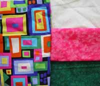 |
This combination is not for the timid! Geometrics are a nice alternative to the usual florals and will work well in this quilt. |
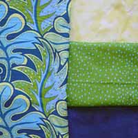 |
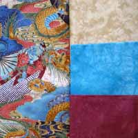
For this Jane Sassaman leaf print, I've chosen the coordinating dot print for the medium accent. The green print has medium blue dots that vary in density across the width. To make sure the fabric would contrast with the other accents, I've used a pale yellow and a very dark blue. |
Quilt Gallery / Teaching Schedule / What’s Stack-n-Whack®?
Cool Stuff / Contact Bethany / Site Map